import type { PolymorphicProps } from "@kobalte/core";
import type { ButtonProps } from "~/components/ui/button";
import type { VariantProps } from "class-variance-authority";
import { Polymorphic } from "@kobalte/core";
import { cva } from "class-variance-authority";
import PanelLeftIcon from "lucide-solid/icons/panel-left";
import { Button } from "~/components/ui/button";
import { Separator } from "~/components/ui/separator";
import { Sheet, SheetContent } from "~/components/ui/sheet";
import { Skeleton } from "~/components/ui/skeleton";
import { TextField, TextFieldInput } from "~/components/ui/text-field";
} from "~/components/ui/tooltip";
import { cn } from "~/lib/utils";
const MOBILE_BREAKPOINT = 768;
const LOCAL_STORAGE_KEY = "sidebar-state";
const SIDEBAR_WIDTH = "16rem";
const SIDEBAR_WIDTH_MOBILE = "18rem";
const SIDEBAR_WIDTH_ICON = "3rem";
const SIDEBAR_KEYBOARD_SHORTCUT = "b";
state: Accessor<"expanded" | "collapsed">;
setOpen: (open: boolean) => void;
openMobile: Accessor<boolean>;
setOpenMobile: (open: boolean) => void;
isMobile: Accessor<boolean>;
toggleSidebar: () => void;
const SidebarContext = createContext<SidebarContext | null>(null);
const context = useContext(SidebarContext);
throw new Error("useSidebar must be used within a Sidebar.");
export function useIsMobile(fallback = false) {
const [isMobile, setIsMobile] = createSignal(fallback);
const mql = window.matchMedia(`(max-width: ${MOBILE_BREAKPOINT - 1}px)`);
const onChange = (e: MediaQueryListEvent | MediaQueryList) => {
mql.addEventListener("change", onChange);
onCleanup(() => mql.removeEventListener("change", onChange));
type SidebarProviderProps = Omit<ComponentProps<"div">, "style"> & {
onOpenChange?: (open: boolean) => void;
style?: JSX.CSSProperties;
function getSidebarState() {
if (!window.localStorage) {
const initialState = localStorage.getItem(LOCAL_STORAGE_KEY);
return initialState === "true";
function setSidebarState(openState: boolean) {
if (!window.localStorage) {
localStorage.setItem(LOCAL_STORAGE_KEY, openState.toString());
const SidebarProvider: Component<SidebarProviderProps> = (rawProps) => {
const props = mergeProps({ defaultOpen: true }, rawProps);
const [local, others] = splitProps(props, [
const isMobile = useIsMobile();
const [openMobile, setOpenMobile] = createSignal(false);
const [_open, _setOpen] = createSignal(getSidebarState());
const open = () => local.open ?? _open();
const setOpen = (value: boolean | ((value: boolean) => boolean)) => {
if (local.onOpenChange) {
return local.onOpenChange?.(
typeof value === "function" ? value(open()) : value,
const toggleSidebar = () => {
? setOpenMobile((open) => !open)
: setOpen((open) => !open);
const handleKeyDown = (event: KeyboardEvent) => {
event.key === SIDEBAR_KEYBOARD_SHORTCUT &&
(event.metaKey || event.ctrlKey)
window.addEventListener("keydown", handleKeyDown);
onCleanup(() => window.removeEventListener("keydown", handleKeyDown));
const state = () => (open() ? "expanded" : "collapsed");
<SidebarContext.Provider value={contextValue}>
"--sidebar-width": SIDEBAR_WIDTH,
"--sidebar-width-icon": SIDEBAR_WIDTH_ICON,
"group/sidebar-wrapper text-sidebar-foreground has-[[data-variant=inset]]:bg-sidebar flex min-h-svh w-full",
</SidebarContext.Provider>
type SidebarProps = ComponentProps<"div"> & {
variant?: "sidebar" | "floating" | "inset";
collapsible?: "offcanvas" | "icon" | "none";
const Sidebar: Component<SidebarProps> = (rawProps) => {
const props = mergeProps<SidebarProps[]>(
collapsible: "offcanvas",
const [local, others] = splitProps(props, [
const { isMobile, state, openMobile, setOpenMobile } = useSidebar();
<Match when={local.collapsible === "none"}>
"bg-sidebar text-sidebar-foreground flex h-full w-[--sidebar-width] flex-col",
<Match when={isMobile()}>
<Sheet open={openMobile()} onOpenChange={setOpenMobile} {...others}>
class="bg-sidebar text-sidebar-foreground w-[--sidebar-width] p-0 [&>button]:hidden"
"--sidebar-width": SIDEBAR_WIDTH_MOBILE,
<div class="flex size-full flex-col">{local.children}</div>
<Match when={!isMobile()}>
class="group peer hidden md:block"
data-collapsible={state() === "collapsed" ? local.collapsible : ""}
data-variant={local.variant}
{/* This is what handles the sidebar gap on desktop */}
"relative h-svh w-(--sidebar-width) bg-transparent transition-[width] duration-200 ease-in-out",
"group-data-[collapsible=offcanvas]:w-0",
"group-data-[side=right]:rotate-180",
local.variant === "floating" || local.variant === "inset"
? "group-data-[collapsible=icon]:w-[calc(var(--sidebar-width-icon)+(--spacing(4)))]"
: "group-data-[collapsible=icon]:w-(--sidebar-width-icon)",
"fixed inset-y-0 z-10 hidden h-svh w-(--sidebar-width) transition-[left,right,width] duration-200 ease-in-out md:flex",
? "left-0 group-data-[collapsible=offcanvas]:left-[calc(var(--sidebar-width)*-1)]"
: "right-0 group-data-[collapsible=offcanvas]:right-[calc(var(--sidebar-width)*-1)]",
// Adjust the padding for floating and inset variants.
local.variant === "floating" || local.variant === "inset"
? "p-2 group-data-[collapsible=icon]:w-[calc(var(--sidebar-width-icon)+(--spacing(4))+2px)]"
: "group-data-[collapsible=icon]:w-(--sidebar-width-icon) group-data-[side=left]:border-r group-data-[side=right]:border-l",
class="bg-sidebar group-data-[variant=floating]:border-sidebar-border flex h-full w-full flex-col group-data-[variant=floating]:rounded-lg group-data-[variant=floating]:border group-data-[variant=floating]:shadow-sm"
type SidebarTriggerProps<T extends ValidComponent = "button"> =
onClick?: (event: MouseEvent) => void;
const SidebarTrigger = <T extends ValidComponent = "button">(
props: SidebarTriggerProps<T>,
const [local, others] = splitProps(props as SidebarTriggerProps, [
const { toggleSidebar } = useSidebar();
class={cn("size-7", local.class)}
onClick={(event: MouseEvent) => {
<span class="sr-only">Toggle Sidebar</span>
const SidebarRail: Component<ComponentProps<"button">> = (props) => {
const [local, others] = splitProps(props, ["class"]);
const { toggleSidebar } = useSidebar();
aria-label="Toggle Sidebar"
"hover:after:bg-sidebar-border absolute inset-y-0 z-20 hidden w-4 -translate-x-1/2 transition-all ease-in-out group-data-[side=left]:-right-4 group-data-[side=right]:left-0 after:absolute after:inset-y-0 after:left-1/2 after:w-[2px] sm:flex",
"[[data-side=left]_&]:cursor-w-resize [[data-side=right]_&]:cursor-e-resize",
"[[data-side=left][data-state=collapsed]_&]:cursor-e-resize [[data-side=right][data-state=collapsed]_&]:cursor-w-resize",
"group-data-[collapsible=offcanvas]:hover:bg-sidebar group-data-[collapsible=offcanvas]:translate-x-0 group-data-[collapsible=offcanvas]:after:left-full",
"[[data-side=left][data-collapsible=offcanvas]_&]:-right-2",
"[[data-side=right][data-collapsible=offcanvas]_&]:-left-2",
const SidebarInset: Component<ComponentProps<"main">> = (props) => {
const [local, others] = splitProps(props, ["class"]);
data-slot="sidebar-inset"
"relative flex w-full flex-1 flex-col bg-background",
"md:peer-data-[variant=inset]:m-2 md:peer-data-[variant=inset]:ml-0 md:peer-data-[variant=inset]:rounded-xl md:peer-data-[variant=inset]:shadow-sm md:peer-data-[variant=inset]:peer-data-[state=collapsed]:ml-2",
type SidebarInputProps<T extends ValidComponent = "input"> = ComponentProps<
const SidebarInput = <T extends ValidComponent = "input">(
props: SidebarInputProps<T>,
const [local, others] = splitProps(props as SidebarInputProps, ["class"]);
"focus-visible:ring-sidebar-ring h-8 w-full bg-background shadow-none focus-visible:ring-2",
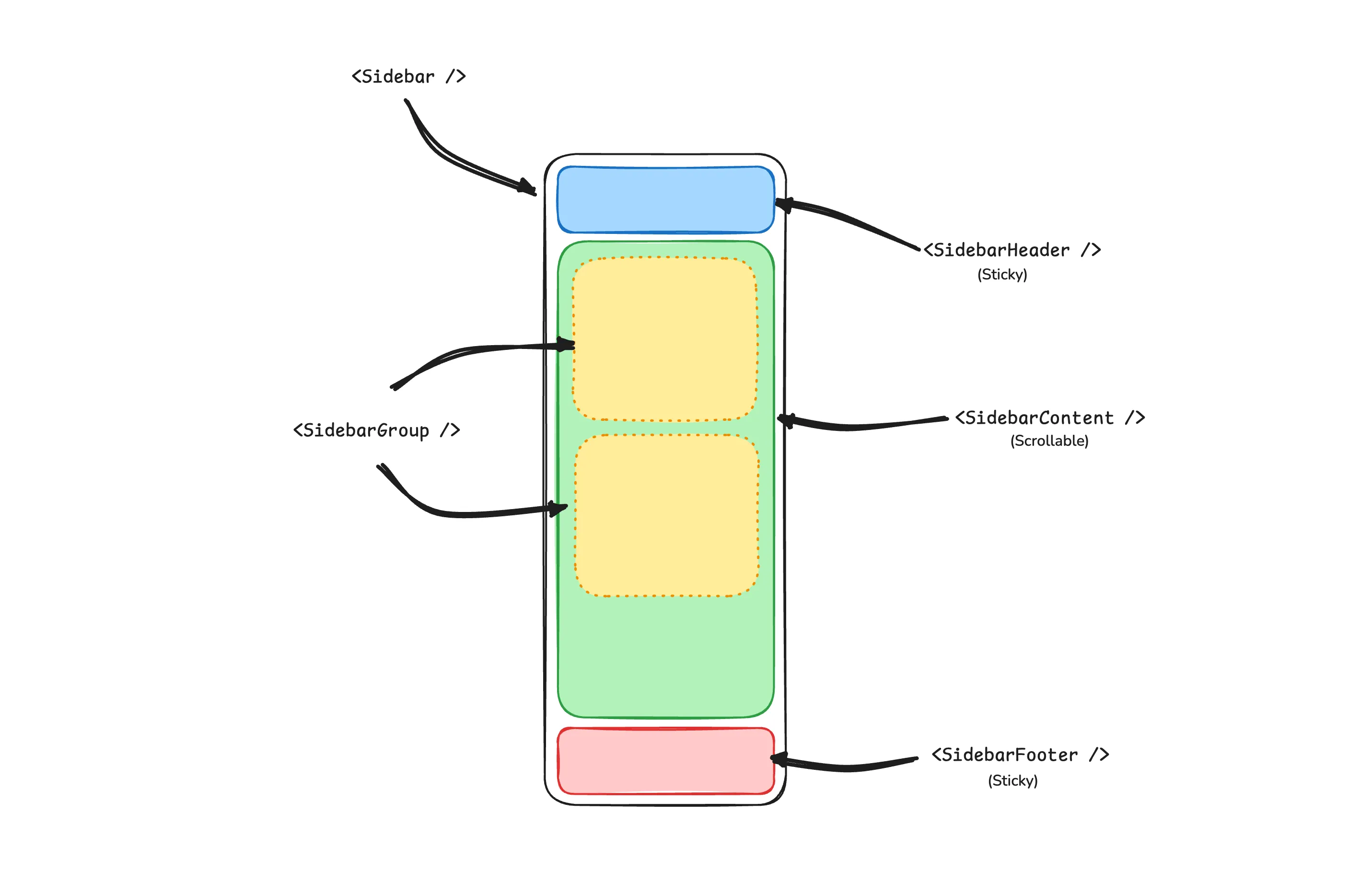
const SidebarHeader: Component<ComponentProps<"div">> = (props) => {
const [local, others] = splitProps(props, ["class"]);
class={cn("flex flex-col gap-2 p-2", local.class)}
const SidebarFooter: Component<ComponentProps<"div">> = (props) => {
const [local, others] = splitProps(props, ["class"]);
class={cn("flex flex-col gap-2 p-2", local.class)}
type SidebarSeparatorProps<T extends ValidComponent = "hr"> = ComponentProps<
const SidebarSeparator = <T extends ValidComponent = "hr">(
props: SidebarSeparatorProps<T>,
const [local, others] = splitProps(props as SidebarSeparatorProps, ["class"]);
class={cn("bg-sidebar-border mx-2 w-auto", local.class)}
const SidebarContent: Component<ComponentProps<"div">> = (props) => {
const [local, others] = splitProps(props, ["class"]);
"flex min-h-0 flex-1 flex-col gap-2 overflow-auto group-data-[collapsible=icon]:overflow-hidden",
const SidebarGroup: Component<ComponentProps<"div">> = (props) => {
const [local, others] = splitProps(props, ["class"]);
class={cn("relative flex w-full min-w-0 flex-col p-2", local.class)}
type SidebarGroupLabelProps<T extends ValidComponent = "div"> =
const SidebarGroupLabel = <T extends ValidComponent = "div">(
props: PolymorphicProps<T, SidebarGroupLabelProps<T>>,
const [local, others] = splitProps(props as SidebarGroupLabelProps, [
<Polymorphic<SidebarGroupLabelProps>
data-sidebar="group-label"
"text-sidebar-foreground/70 ring-sidebar-ring flex h-8 shrink-0 items-center rounded-md px-2 text-xs font-medium transition-[margin,opa] duration-200 ease-in-out outline-none focus-visible:ring-2 [&>svg]:size-4 [&>svg]:shrink-0",
"group-data-[collapsible=icon]:-mt-8 group-data-[collapsible=icon]:opacity-0",
type SidebarGroupActionProps<T extends ValidComponent = "button"> =
const SidebarGroupAction = <T extends ValidComponent = "button">(
props: PolymorphicProps<T, SidebarGroupActionProps<T>>,
const [local, others] = splitProps(props as SidebarGroupActionProps, [
<Polymorphic<SidebarGroupActionProps>
data-sidebar="group-action"
"text-sidebar-foreground ring-sidebar-ring hover:bg-sidebar-accent hover:text-sidebar-accent-foreground absolute top-3.5 right-3 flex aspect-square w-5 items-center justify-center rounded-md p-0 transition-transform outline-none focus-visible:ring-2 [&>svg]:size-4 [&>svg]:shrink-0",
// Increases the hit area of the button on mobile.
"after:absolute after:-inset-2 after:md:hidden",
"group-data-[collapsible=icon]:hidden",
const SidebarGroupContent: Component<ComponentProps<"div">> = (props) => {
const [local, others] = splitProps(props, ["class"]);
data-sidebar="group-content"
class={cn("w-full text-sm", local.class)}
const SidebarMenu: Component<ComponentProps<"ul">> = (props) => {
const [local, others] = splitProps(props, ["class"]);
class={cn("flex w-full min-w-0 flex-col gap-1", local.class)}
const SidebarMenuItem: Component<ComponentProps<"li">> = (props) => {
const [local, others] = splitProps(props, ["class"]);
class={cn("group/menu-item relative list-none", local.class)}
const sidebarMenuButtonVariants = cva(
"peer/menu-button ring-sidebar-ring hover:bg-sidebar-accent hover:text-sidebar-accent-foreground active:bg-sidebar-accent active:text-sidebar-accent-foreground data-[active=true]:bg-sidebar-accent data-[active=true]:text-sidebar-accent-foreground data-[state=open]:hover:bg-sidebar-accent data-[state=open]:hover:text-sidebar-accent-foreground flex w-full items-center gap-2 overflow-hidden rounded-md p-2 text-left text-sm transition-[width,height,padding] transition-colors outline-none group-has-[[data-sidebar=menu-action]]/menu-item:pr-8 group-data-[collapsible=icon]:!size-8 group-data-[collapsible=icon]:!p-2 focus-visible:ring-2 disabled:pointer-events-none disabled:opacity-50 aria-disabled:pointer-events-none aria-disabled:opacity-50 data-[active=true]:font-medium [&>span:last-child]:truncate [&>svg]:size-4 [&>svg]:shrink-0",
default: "hover:bg-sidebar-accent hover:text-sidebar-accent-foreground",
"hover:bg-foreground-hover bg-foreground text-background hover:text-background active:bg-foreground/80 active:text-background",
"hover:bg-sidebar-accent hover:text-sidebar-accent-foreground bg-background shadow-[0_0_0_1px_hsl(var(--sidebar-border))] hover:shadow-[0_0_0_1px_hsl(var(--sidebar-accent))]",
lg: "h-12 text-sm group-data-[collapsible=icon]:!p-0",
type SidebarMenuButtonProps<T extends ValidComponent = "button"> =
VariantProps<typeof sidebarMenuButtonVariants> & {
const SidebarMenuButton = <T extends ValidComponent = "button">(
rawProps: PolymorphicProps<T, SidebarMenuButtonProps<T>>,
const props = mergeProps(
{ isActive: false, variant: "default", size: "default" },
const [local, others] = splitProps(props as SidebarMenuButtonProps, [
const { isMobile, state } = useSidebar();
<Polymorphic<SidebarMenuButtonProps>
data-sidebar="menu-button"
data-active={local.isActive}
sidebarMenuButtonVariants({ variant: local.variant, size: local.size }),
<Show when={local.tooltip} fallback={button}>
<Tooltip placement="right" openDelay={0} closeDelay={0}>
<TooltipTrigger class="w-full">{button}</TooltipTrigger>
<TooltipContent hidden={state() !== "collapsed" || isMobile()}>
type SidebarMenuButtonWithShortcutProps = {
const SidebarMenuButtonInnerWithShortcut = (
props: SidebarMenuButtonWithShortcutProps,
<div class="flex w-full items-center justify-between">
<div class="flex items-center gap-2">{props.children}</div>
<span>{props.shortcut}</span>
type SidebarMenuActionProps<T extends ValidComponent = "button"> =
const SidebarMenuAction = <T extends ValidComponent = "button">(
rawProps: PolymorphicProps<T, SidebarMenuActionProps<T>>,
const props = mergeProps({ showOnHover: false }, rawProps);
const [local, others] = splitProps(props as SidebarMenuActionProps, [
<Polymorphic<SidebarMenuActionProps>
data-sidebar="menu-action"
"text-sidebar-foreground ring-sidebar-ring hover:bg-sidebar-accent hover:text-sidebar-accent-foreground peer-hover/menu-button:text-sidebar-accent-foreground absolute top-1.5 right-1 flex aspect-square w-5 items-center justify-center rounded-md p-0 transition-transform outline-none focus-visible:ring-2 [&>svg]:size-4 [&>svg]:shrink-0",
// Increases the hit area of the button on mobile.
"after:absolute after:-inset-2 after:md:hidden",
"peer-data-[size=sm]/menu-button:top-1",
"peer-data-[size=default]/menu-button:top-1.5",
"peer-data-[size=lg]/menu-button:top-2.5",
"group-data-[collapsible=icon]:hidden",
"peer-data-[active=true]/menu-button:text-sidebar-accent-foreground group-focus-within/menu-item:opacity-100 group-hover/menu-item:opacity-100 data-[state=open]:opacity-100 md:opacity-0",
const SidebarMenuBadge: Component<ComponentProps<"div">> = (props) => {
const [local, others] = splitProps(props, ["class"]);
data-sidebar="menu-badge"
"text-sidebar-foreground pointer-events-none absolute right-1 flex h-5 min-w-5 items-center justify-center rounded-md px-1 text-xs font-medium tabular-nums select-none",
"peer-hover/menu-button:text-sidebar-accent-foreground peer-data-[active=true]/menu-button:text-sidebar-accent-foreground",
"peer-data-[size=sm]/menu-button:top-1",
"peer-data-[size=default]/menu-button:top-1.5",
"peer-data-[size=lg]/menu-button:top-2.5",
"group-data-[collapsible=icon]:hidden",
type SidebarMenuSkeletonProps = ComponentProps<"div"> & {
const SidebarMenuSkeleton: Component<SidebarMenuSkeletonProps> = (rawProps) => {
const props = mergeProps({ showIcon: false }, rawProps);
const [local, others] = splitProps(props, ["class", "showIcon"]);
// Random width between 50 to 90%.
const width = createMemo(() => `${Math.floor(Math.random() * 40) + 50}%`);
data-sidebar="menu-skeleton"
class={cn("flex h-8 items-center gap-2 rounded-md px-2", local.class)}
<Skeleton class="size-4 rounded-md" data-sidebar="menu-skeleton-icon" />
class="h-4 max-w-[--skeleton-width] flex-1"
data-sidebar="menu-skeleton-text"
"--skeleton-width": width(),
const SidebarMenuSub: Component<ComponentProps<"ul">> = (props) => {
const [local, others] = splitProps(props, ["class"]);
"border-sidebar-border mx-3.5 flex min-w-0 translate-x-px flex-col gap-1 border-l px-2.5 py-0.5",
"group-data-[collapsible=icon]:hidden",
const SidebarMenuSubItem: Component<ComponentProps<"li">> = (props) => (
type SidebarMenuSubButtonProps<T extends ValidComponent = "a"> =
const SidebarMenuSubButton = <T extends ValidComponent = "a">(
rawProps: PolymorphicProps<T, SidebarMenuSubButtonProps<T>>,
const props = mergeProps({ size: "md" }, rawProps);
const [local, others] = splitProps(props as SidebarMenuSubButtonProps, [
<Polymorphic<SidebarMenuSubButtonProps>
data-sidebar="menu-sub-button"
data-active={local.isActive}
"text-sidebar-foreground ring-sidebar-ring hover:bg-sidebar-accent hover:text-sidebar-accent-foreground active:bg-sidebar-accent active:text-sidebar-accent-foreground [&>svg]:text-sidebar-accent-foreground flex h-7 min-w-0 -translate-x-px items-center gap-2 overflow-hidden rounded-md px-2 outline-none focus-visible:ring-2 disabled:pointer-events-none disabled:opacity-50 aria-disabled:pointer-events-none aria-disabled:opacity-50 [&>span:last-child]:truncate [&>svg]:size-4 [&>svg]:shrink-0",
"data-[active=true]:bg-sidebar-accent data-[active=true]:text-sidebar-accent-foreground",
local.size === "sm" && "text-xs",
local.size === "md" && "text-sm",
"group-data-[collapsible=icon]:hidden",
SidebarMenuButtonInnerWithShortcut,